Color Theory: Marketing, Branding, and the Psychology of Color
A few years ago, Entrepreneur published an article on the psychology of color and the misconceptions around color, branding, and color persuasion. Additionally, it discussed how color interpretations can be flawed based on everyone’s individual upbringing. While color interpretation is absolutely dependent on personal experiences, there has been extensive research on how color can persuade and affect consumers in several ways.
Every time a consumer interacts with a brand, an opportunity exists for that particular company to influence their audiences’ perceptions. It is up to the marketer to choose what designs and which colors will convince a consumer to make a purchase. By educating oneself on the psychology behind the color theory, marketers can further tap into branding techniques and better connect with their market. This will ultimately lead to a stronger brand-consumer relationship and an increase in profit.
Up to 90% of a person’s assessment on products or services is based on colors alone as long as we perceive the brand color as one that fits a brand’s personality [1]. In other words, our likeness towards a brand can be greatly persuaded by color. One study entitled The Interactive Effects of Colors explains that the function of a product should be congruent to the color through which it is displayed; a product’s personality must be reflected in the brand’s colors.
When choosing brand colors, it’s important to consider brand personality based on what color suits the characteristics of your product/company. It is crucial that the brand color is appropriate. Clearly, a camping brand who markets itself as outdoorsy and rugged wouldn’t want to use pink sparkles. Additionally, the colors chosen should stand out from other competitors.
To better decipher brand personality, consider these five dimensions, or the five ways people consistently react to brand identities. Most brands fall into one trait, but some have a crossover.
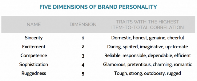
By deciphering which of these five personalities a brand fits under, marketers are able to craft their brand in a way that makes the most sense and can reap profits by appropriately appealing to their consumers.
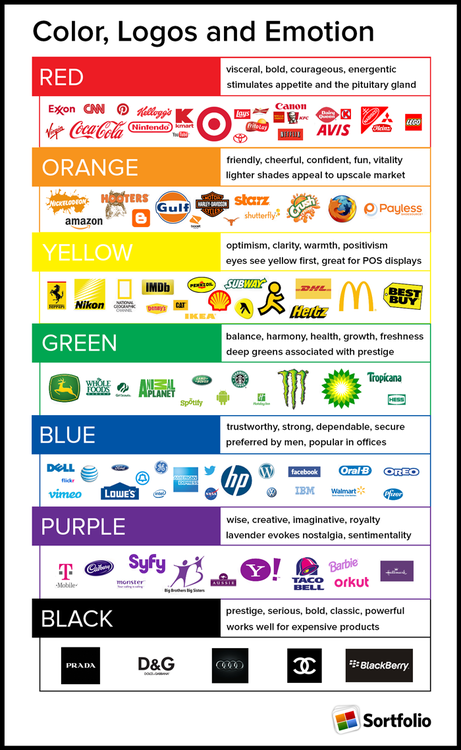
While different colors yield different interpretations based on the person, many colors get similar responses from a majority of people. For example, red and yellow are used to induce an appetite (i.e. every fast food chain in America). Blue is often used to depict trust, expertise, and strength (i.e. Lowe’s, IBM, American Express). Blue is also said to suppress appetite, so it is rarely advertised along with food companies. Green, the color of nature, is symbolizes harmony, freshness, health (i.e. Whole foods) and has a strong correspondence with safety, hence its use in traffic signs. Orange indicates efficiency and speed. Next time you are in a grocery store, notice the colors of laundry detergents. Many are orange and blue – blue, in this case, symbolizes cleanliness and orange captures a dynamic energy which communicates “industrial strength and cleaning power” [2]. Blue and orange are also opposites on the color wheel and therefore can be an aesthetically pleasing pair.
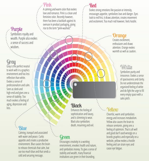
Our society depicts basic moods, emotions, and feelings based on the rainbow spectrum, as seen below:
Color theories create a logical structure for color and encompass an assembly of definitions, concepts, and design applications. For these theories, consider three different parts: the color wheel, color harmony, and the context of how colors are used. On the other hand, be aware that each color is open to numerous interpretations based on individual interpretations and experiences and that the following is a broad collection of common interpretations of colors.
Additionally, consider certain cultural differences that may lead to skewed perceptions of your brand. For example, the color red could be interpreted as love and passion in western cultures, good fortune in Chinese cultures, and mourning in South African cultures.
Red: The color of fire and blood, red is often associated with energy, war, danger, strength, and power, as well as passion, love, and desire. In the U.S., red is commonly used to depict romance, and arouse different senses (erotic feelings, danger, energy, appetite). It is one of the most emotionally intense colors and has often been used to raise blood pressure. Red indicates courage and vigor.
Pink: Pink has long been associated with the color of happiness. Viewed as a lighthearted color, it represents youth, sensuality, and hope. It has been used in prison cells to reduce erratic behavior and stimulate energy.
Purple: Purple is the color of royalty, nobility, and luxury. The negative associations with purple are decadence, conceit, and pomposity. Purple is also the color for mourning and has been rumored as a color used for mental disorder care due to its stimulation of the brain.
Blue: Blue is often paired with trust, loyalty, intelligence, and understanding. Light blue tends to mean peace and serenity. Dark blue is related to authority, conservativeness, confidence, and tradition.
Black: Black is often associated with desire, greed, and mourning. It symbolizes the hidden, secretive, and unknown. In color psychology, black creates a barrier from itself and the outside world, which can provide comfort. Black is the absorption of all color and the absence of light. It means power, jurisdiction, and implies self-control, independence, and authority.
Yellow: Yellow often represents the color of happiness, energy, attention, and intellect. This color produces a warming effect, stimulates mental activity, and generates muscle energy. Dull yellow signifies decay, sickness, betrayal, egoism, and madness. The human eye processes yellow immediately, which is why it is used for cautionary purposes.
Orange: A combination of cheerful yellow and fire-y red, orange conveys efficiency, affordable pricing, and dependence. Often, it is associated with happiness, tropical weather, attraction, determination, and creativity. Orange stimulates the appetite and its hue can convey a sense of healthiness as well as the fall season. People also associate orange with strength.
Green: Green symbolizes health, nature, productivity, and relaxation. It is commonly associated with health products, the environmentally conscious, and is used by financial companies to depict wealth. Green is said to be the most calming shade to the human eye.
What colors are your brand and why? Let us know on Twitter or Facebook.
Source 3