Logos that Pop on the Big Screen
More than one week later, how many of those companies do you still remember from Super Bowl commercials?
The Super Bowl is one of the most popular days in the year for advertising. Forget about the game, consumers tune in just for the innovative ads that went for a whopping $5 million for a 30 second slot. While ads for the Super Bowl are usually dominated by big names like Budweiser, Doritos, and Volkswagen, lesser known companies have the potential to catalyze a huge increase in brand recognition, or at the very least, a boost in traffic for the duration of their 30 to 60 seconds of fame. Here at the ConceptDrop blog, we take a look at the logos of smaller companies that made it to airtime and whether or not they popped on the big screen in 2016.
- Avocados from Mexico
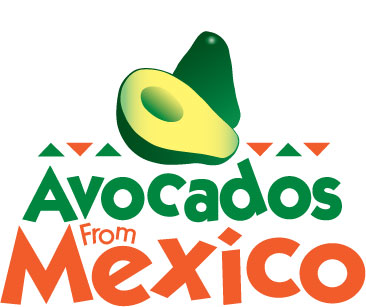
Making waves for its quirky and on-trend commercial, Avocados from Mexico crafted a 60 second ad featuring guac-hungry aliens on a set that was charmingly and unpretentiously low budget. A creative hashtag (#AvosInSpace) and multiple popular culture references (e.g. #thedress) made it clear that the company was targeting younger consumers.
Yet, how memorable was the logo? For a nonprofit marketing arm of two avocado distributers, the eponymous logo is aptly reminiscent of a distribution sticker you might find on a real avocado and brings forth vague connotations of Frito-Lay’s Tostitos logo. The text, while perhaps more characters than is advised, has a jaunty, playful spirit appropriate for the target demographic. Despite these positives, 60 seconds don’t last forever (even on YouTube), and it’s doubtful that the brief flash of the logo at the end of the advertisement was sufficient to make a lasting impact on viewers. This might end up as a classic case of memorable commercial, unmemorable brand.
Bottom line: creative commercial, insufficient airtime for brand logo
![]()
The NoMore Project teamed up with the NFL to raise public awareness about ending domestic violence and sexual assault. Graphically simple and powerful in its message, No More was able to make the most of the donated 30-second time slot for a public service commercial called “Text Talk.” Although the logo was given a comparable amount of screen time as Avocados From Mexico, since it’s strongly indicative of the organization’s mission, the psychological effect on the viewer lasts much longer. The bold lettering on white background implies impact and strength while the grey and blue tones associate viewers with balance and trust. The logo is also highly adaptable. For example, it easily converts to the “No Más” campaign they run targeted to Latino communities and works well in one of their taglines: “Because it’s someone you KNOW.”
Bottom line: powerful message + simple logo = big impact
- SoFi Bank
Arguably one of the most talked about advertisements this Super Bowl Sunday was a 30-second clip created by SoFi, or Social Finance, Inc.. Founded 5 years ago by graduates of Standford Business School, SoFi provides loans in areas like student loan refinancing, mortgages, and personal loans that are targeted to young professionals. Humorous, punny, and energetic, their commercial managed to introduce a tantalizing bit of information about their radical new way to “enter a bank-less world.” Despite the effectiveness of their commercial, the SoFi logo lacked any clear connection with its business. The single gray circle in the middle in the midst of 8 others could be an indicator of SoFi’s emphasis on “great” individuals that they loan to. Yet, without the company name, it is doubtful that the logo would be recognizable to most viewers.
Bottom line: innovative business idea, lackluster logo
A commercial that relied heavily on celebrity endorsement was the gaming app Mobile Strike. Arnold Schwarzenegger, a figure not only in the commercial but within the game itself, muscles his way through an elevator of people while slow motion, special effects, and forceful classical music add to the spectacle. For a gaming app, the lifespan on their logo is likely much shorter and less important than traditional businesses and it is reflected in their design. The logo uses a generic background reminiscent of concrete walls common in many gaming apps and the firey nature of logo is wholly unoriginal. Despite these shortcomings, the commercial does do a good job of emphasizing the “mobile” aspect of the app, using a phone as the focus of the story line. Overall, the company relies on Arnold for brand recognition than anything else and while not original, the celebrity endorsement alone is probably a sufficient memory jogger of the game.
Bottom line: likely to only be remembered as new ad featuring Arnold Schwarzenegger
- Michelob Ultra
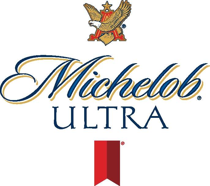
Beer commercials are a staple during the Super Bowl. Budweiser might have cemented its place among advertisement history with their heartstrings tugging puppy and Clydesdale series and frankly, we’ve come to except this kind of commercial genre. Michelob Ultra’s 30-sec montage made us wonder—are they really selling beer?
The commercial quickly spun through a series of clips showcasing individuals sweating and puffing through their intense workout regime only to abruptly stop and show…a beer uncapping? Michelob is trying to tell viewers essentially that they can have their cake and eat it too. The ad was sufficiently different enough to be memorable but Michelob’s logo looks like any other beer brand. Without further attempts at differentiating themselves from other beer brands, people will doubtless reach for a Bud Light instead.
Bottom line: interesting fitness commercial for a beer company, average logo
For a hefty price point, the Super Bowl offers a mass audience and lots of free media publicity. While larger, more established corporations have the money to spend on ad time and can rely on their already established branding to draw the kind of audience and engagement they seek, a high return on investment is not certain for small-time businesses and non-profits. The audience might remember the commercials, but will they remember the brand? Did you?
Interested in more about the role of color in branding and marketing? Click on!