Olympic Design, Takes the Gold
The 2018 winter Olympics are in full swing! While we only experience an Olympics every two years, Olympic committees are constantly occupied with event planning and design for future games. As we discussed in our blog post entitled “The 2022 Olympic Logo takes the Gold,” Beijing just released their logo for the 2022 games (aka the next time we’ll be huddling around the TV during a snowstorm to watch people ice luge and figure skate).
Meanwhile, Japan has also been thinking ahead for the upcoming summer games. The Tokyo Olympics board recently published a call for design submissions for the gold, silver, and bronze medals. The competition is open to Japanese designers from all walks of life, so long as they’re at least eighteen-years-old and are Japanese or currently live in Japan. According to the Paralympics site, “…members of the Tokyo 2020 Brand Advisory Board, former athletes and professional designers will review all entries and select a shortlist of designs by April 2018. The designers of these and a manufacturing institution will create three-dimensional mock-ups of the shortlisted designs, with the winning design set being selected in August 2018. The new medals will be unveiled in 2019.”
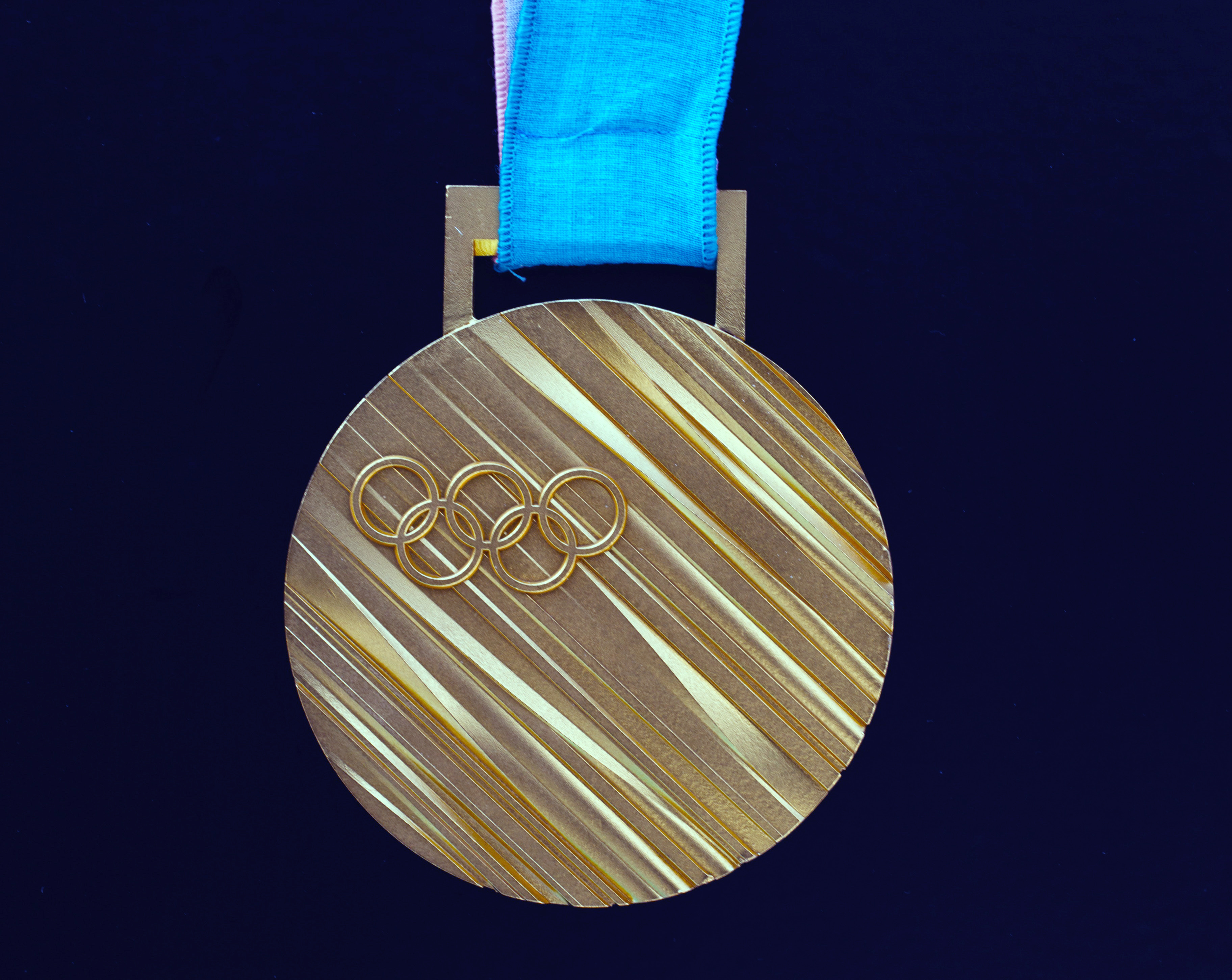
During the first Olympic games, participants were awarded an olive wreath and a silver medal. Nowadays, medals are carefully crafted with design in mind. The Olympics website claims that in 1928, thirty-two years after the first modern Olympic games, medals/medal design had a planned out design scheme featuring a “goddess of victory” on one side and “an Olympic champion” on the other. Then, in the 70s for the games in Munich, medal designs changed by updating the look of the goddess. Winter Olympic medals have always differed from the summer medals (the first winter Olympics took place in 1924) by including “cultural and aesthetic elements.” This year, the Pyeongchang medals have a clean design emblazoned with the Olympic rings on one side and the Pyeongchang logo on the other.
Outside of the medal designs, we’ve noticed other aspects of skillful designs this year. Artwork for the Olympics has always been a buzz topic, probably because there is so much to design for the Olympics and for the millions of viewers. The hosting country has to design poster, logos, uniforms, medals, etc.. While the focus on the Olympics is the athletic events, when you think about it, the Olympic games are a designer’s heaven, heavily branded to represent the host country, the year, and the games themselves alongside international cooperation/competition.
We want to give a designer’s shoutout to the newly designed pictograms. This year, they are more angled and geometric, a nice change from the rounded 2014 Winter Olympic designs for the winter activities. We love Google’s home page animation, featuring a cartoon creature sleeping, waking up, and then sliding down a sled-like path winning a ribbon at the end. Finally, what’s an Olympics without discussing the uniform design? During the opening ceremonies and the games themselves, each participant wears a specific outfit, most commonly coordinating to their country’s colors. E! Online mentioned a few of their favorites from the opening ceremonies, including Nigeria’s green and white suits with hats and Bermuda’s athletes sporting red shorts and blue suit jackets.
What designs have you been noticing during this 2018 Olympics?