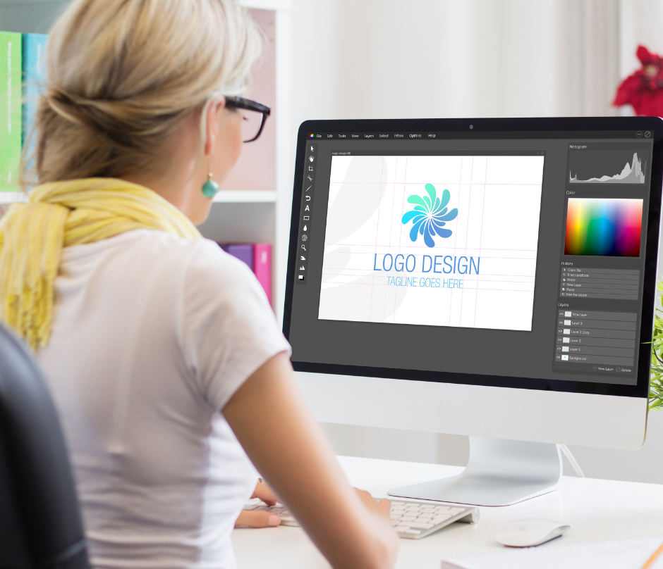
The Guidelines You Should Follow When Designing a Logo [Part 1]
Logos provide more than just aesthetics. Your logo should reflect your brand’s personality.
Do you need a designer to achieve this? Fortunately not. Todays year, you may create a professional-looking, attractive, and useful logo with a free logo maker.
You must follow some easy but essential guidelines while designing an effective logo. So this article will discuss the guidelines for logo design when creating it.
What Are Some Logo Design Guidelines?
1. Learn About Conceptual Icons
Icons simplify your brand’s personality in logo design. A prevalent misperception is that your icon should depict your product or service. Your icon is a symbol, not an image. It must be eye-catching. Graphic icons have additional visual weight. Your icon must be easy to remember.
2. Use The Available Space
Logo makers offer many ways to add your name and phrase. Taglines, or slogans, are dramatic statements that capture a brand’s essence. Not all businesses have taglines. That’s fine, but don’t squander important space. If your name allows, split it into two lines with the same font and size.
3. Try Around With Capital Or Lowercase Letters
Sometimes minor details can make all the difference in a well-designed logo. Even something as easy as trying with a letter case can elevate your trademark to entirely new heights. Usually, lowercase logos are more approachable, while uppercase logos convey a strong sense of authority. Yet, you can still use capital text while softening the look with your color scheme. Everything depends on balance.
4. Think About Handwritten Fonts
Logo design trends include creative typography. Logos benefit from handwritten typefaces. Using handwritten typography as your tagline’s font has particular advantages. These guidelines for logo design would be for you if you chose one of these font types. Remember that handwritten fonts can appear less real when written in all capitals.
5. Balance Your Tagline
Making the tagline shorter than a business name is an easy guideline to ensure your logo makes sense. We advise sticking to no more than 25 to 30 characters because of this. For the same reason, using a thinner font for your tagline is advisable if you use a thicker one for your name.
6. Adjust Your Brand’s Name And Tagline
Here is the design key rule: visual balance is everything. The tagline should always perfectly align with your name despite its smaller size. This will create a sense of unity for your viewers and potential customers. You can fix the issue if your name or tagline is significantly longer by changing the font or size of either element.
7. Allow Your Logo To Bloom
Like Mona Lisa, certain trademarks look their finest when enclosed in a lovely frame. Leave enough space between your selected frame and logo if you go this way. Give your logo freedom to bloom. Increase the frame size or reduce the font size if things seem crowded.
Be ready for [Part 2] because we will continue to discuss what are some logo design guidelines you need to know and consider when designing your logo.

