
What makes a great presentation?
This method of visually sharing and presenting information has been around since 1987 when PowerPoint was invented. Yet, even in recent years, good presentations are hard to come by and great presentations are even rarer.
While the presenter and his or her speaking skills play a factor in the success of a presentation, another key part is the presentation’s actual design. Through examples created by ConceptDrop Creatives, let’s take a look at the in’s and outs of what makes a great Keynote or PowerPoint presentation design.
Collective Science’s Keynote Presentation


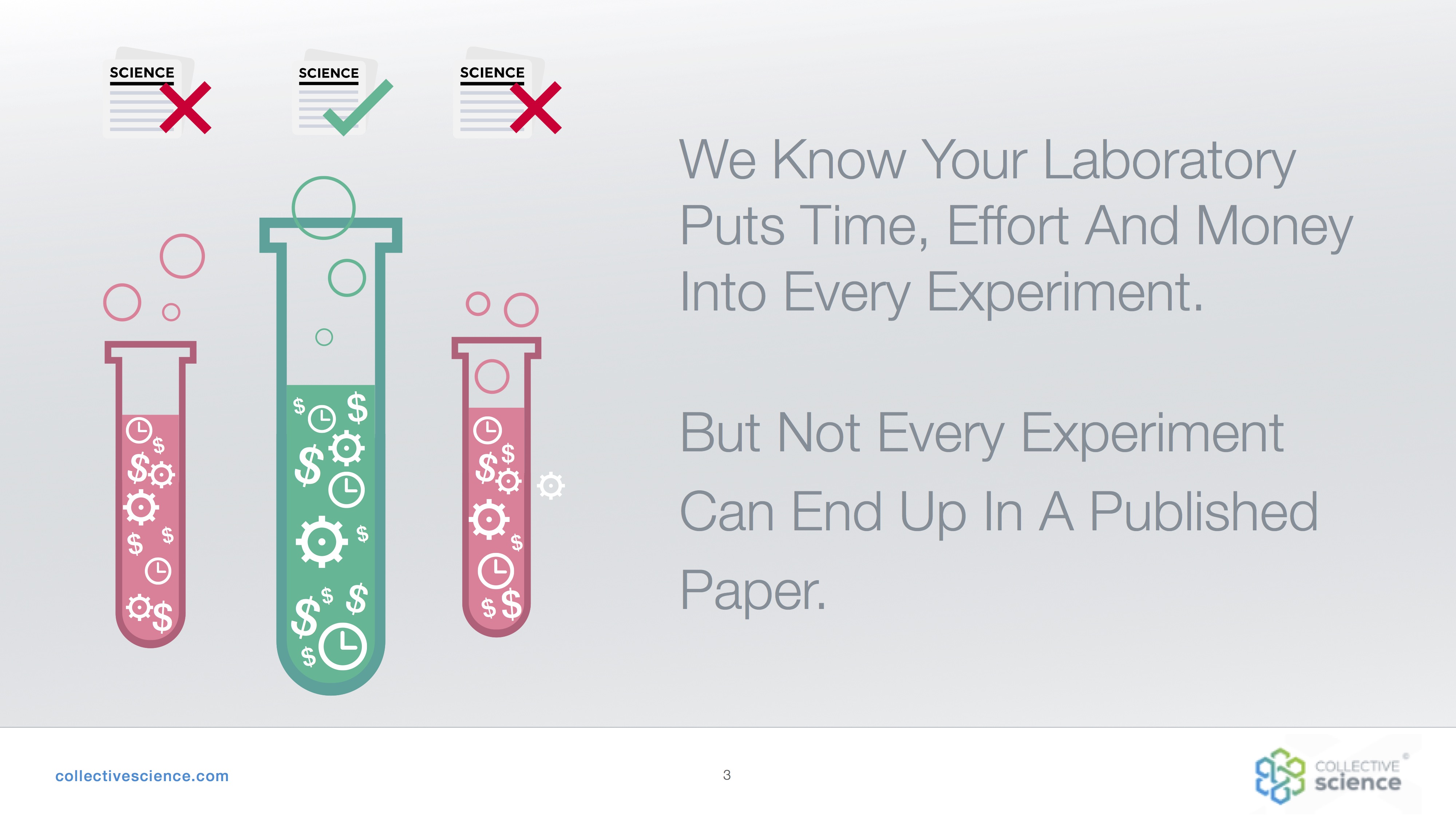


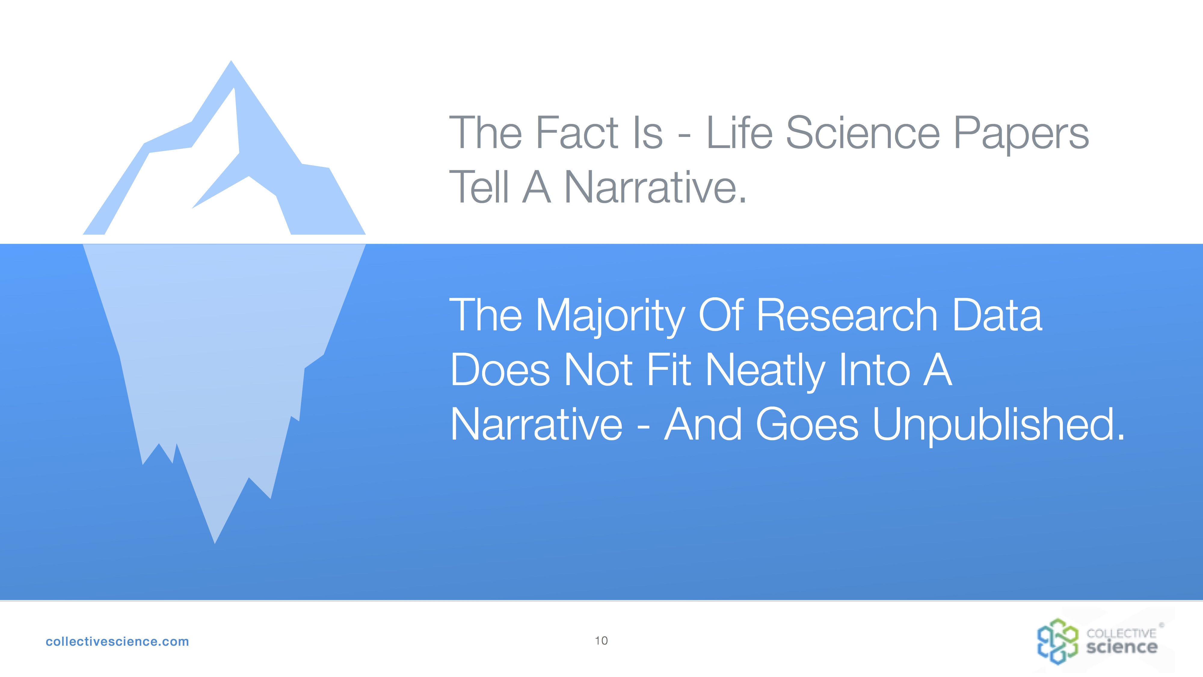

There are a variety of elements that make this presentation stand out. For starters, you can see the designer created a deck that is largely visual, with minimal text per slide. Presentation Magazine says, “a good rule of thumb is less than 40 words per slide”. In addition, the presentation follows the Rule of Thirds (as seen on slides 2-5). This common design strategy is an age-old psychology trick used for comprehending information, as well as a strong principle of design. Lastly, the deck consists of handcrafted imagery and icons from start to finish. The test tubes on slide 3 and the iceberg on 7 demonstrate that this presentation was carefully created by a talented presentation designer.
Ting’s PowerPoint Presentation


This PowerPoint deck perfectly captures the energy and liveliness of Ting–a growing company aiming to reinvent the mobile phone plan industry–through unique and playful design elements. A circular motif is used throughout almost every slide, which can be seen in the corner footers and circular areas of text, even the outline of stock photos. This is atypical for a deck created in PowerPoint or Keynote because these programs can be limiting to creativity, as opposed to design-centric programs such as Adobe Photoshop and Illustrator. In addition, Ting’s deck can stand alone, having an ample amount of information for the viewer to understand their message, without being overly text-heavy.
National Urban League Deck


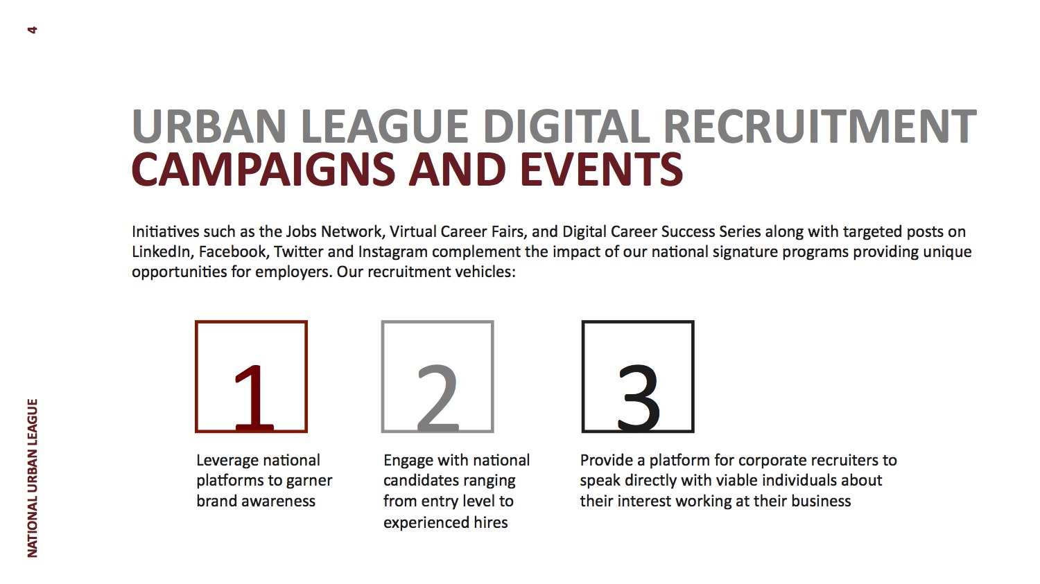


The designer did an excellent job of incorporating the brand of National Urban League, a nonprofit organization based in New York, into a polished and crisp presentation. To begin, the stock imagery used throughout the deck aligns with their messaging and enhances the content on each slide, rather than distracting the viewer. Similar to the Collective Science’s Keynote presentation, this deck follows the Rule of Thirds both in orientation (such as slides 2, 4, and 6) and content, like on slide 3. Altogether, NUL’s final presentation looks strong and unified, much like their organization.
Ultimately, the best presentation decks look like they weren’t created in PowerPoint or Keynote. To achieve this, the touch of a creative with an expertise in presentation design is necessary. These individuals are able to not only fully exploit all of the capabilities PowerPoint and Keynote allow, but can also incorporate their skills in Adobe programs.
With presentations being the popular way to convey information, it only makes sense that 70 percent of people use the method. According to Venngage.com, 67 percent of individuals create their own presentation projects with almost half stating it took eight or more hours to complete. Imagine the time saved by hiring an expert to do the work for you. At ConceptDrop, our highly skilled freelancers are able to complete a quality presentation within 24 hours of the request.
If interested in beginning a presentation with us click here.