We love you, Gotham. But…
Gotham, we adore your stately and geometric shape. You’re beautifully gender neutral (especially for originally being created for GQ magazine to look “masculine, new, and fresh”) and we can use you in practically any setting! You never fail to look clean and polished.
But… we’re a bit tired of seeing your font family ev-er-y-where we turn. Don’t take offense, you’re just so awesome. It’s not you, it’s us.
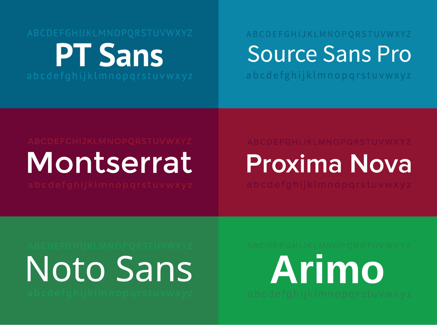
In all seriousness, typefaces like Helvetica Neue, Roboto, and yes, Gotham, are (arguably too) frequently used fonts by designers today. Including ourselves. Guilty as charged. That being said, there’s a lot of great alternatives out there that don’t always get the recognition they deserve. Here’s some our favorites.


So next time you go to type in “Lato” , give one of these a go. P.S. did we mention these options are web friendly? Score.