Spring Cleaning: Logo Edition
When companies are slow to update their brands (i.e. in the form of logos, graphics, websites, posters, apps, etc.), it can hurt the company’s credibility. Branding is important because it is ultimately the first tangible aspect of a company for consumers to recognize.
While some franchises may take a long time to change their designs, here are a few that have recently realized that their logos needed a refresher and could be inspirational for your company’s own branding. In our opinion, it was well worth the wait…
Source
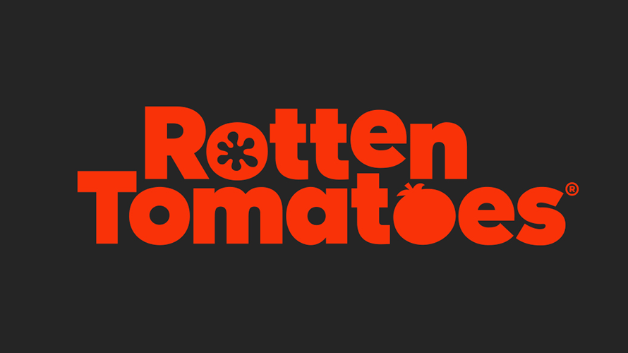
1. Rotten Tomatoes
Rotten Tomatoes, a movie rating website, was founded in 1998; however, it’s been over a decade since their brand has received any design attention. In 2001, the “Rotten Tomato” logo was set in a bright yellow hue, embolden with a black background that outlined the letters. Recently, the color and shadow effect was dropped, leaving us with a crisp, red design. The letters are now flat, but that doesn’t mean that they are not dynamic. The o’s of the new design are also updated: one is in the shape of a cut-open tomato while the other looks like a full tomato with a vine on top. According to Design Week, “ Emily Oberman has given TV and film review website Rotten Tomatoes a new logo, icons, and color palette, which look to ‘modernise’ it while retaining its ‘familiar elements.’”
How is Rotten Tomatoes inspirational for your logo? Think playfully about how the letters in your logo could also resemble an image related to your company.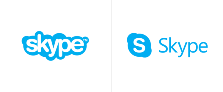
Source
2. Skype
Last year, Skype’s site graphics got a makeover. The old design included the word “skype” in white, lower-case letters with a puffy, cloud-like blue outline surrounding the text. Now, the design, much like Rotten Tomatoes, is simply in blue, a la the Microsoft font. This is to associate the video chat product with Microsoft and the association works. Meanwhile, the Skype app logo has mostly stayed the same over time.
The takeaway from Skype? Think simplicity. Is your company’s logo bulky? Maybe it’s time to make it look sleeker.
Source
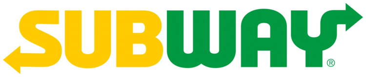
3. Subway
There is definitely a trend in logos nowadays of dropping the emphasized background surrounding a text. Subway, one of the United States’ most popular deli sandwich chains, is no stranger to this strategy. Their logo a few years ago went from angled letters spelling “Subway” in white and yellow with a green shadow background to a cleaner font showcasing the company’s colors by setting the prefix “sub” in yellow and the suffix “way” in green. Subway is working to incorporate its new logo into the stores themselves as well. According to Design Week, newly designed stores will highlight Subway’s freshness by showcasing more vegetable-like colors in the stores and through their new computer screen ordering system slowly being implemented nationally. This is Subway’s way of promoting healthy eating options through their color choices while updating their look (you can read more about color psychology theories here).
What can you learn from Subway? Look at the colors of your company’s logo. Are they being utilized in the best possible format? If not, manipulate the color scheme into the logo’s design.
Source
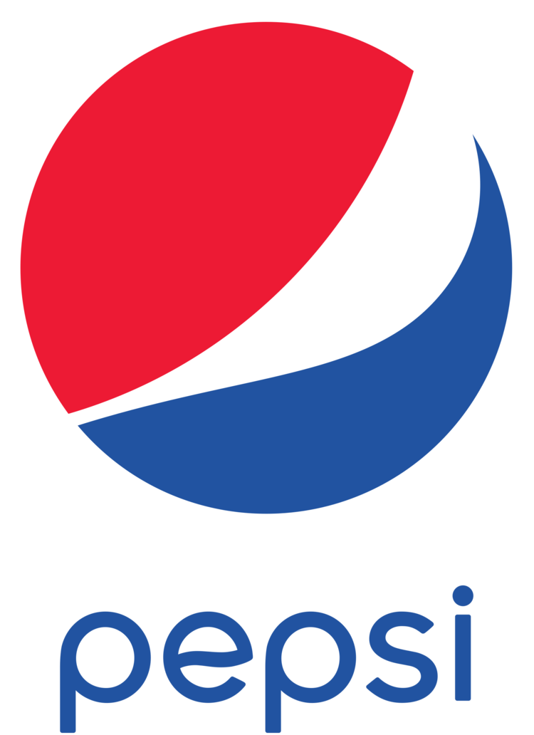
4. Pepsi
In 1998, the Pepsi logo incorporated a blue background with the word “Pepsi” superimposed over their signature red, white, and blue, circle. Designers in 2011 changed that and now the logo has similar features, but ultimately looks cleaner and positively minimalistic. The designers moved the circle to the left of the word “Pepsi” in white letters, which are half the size of the 1998 version. Additionally, according to Graphic Design USA, Pepsi just launched a sparkling water beverage called Bubly in a similar font to showcase unity between the Pepsi products.
What can you learn from Pepsi? If there is a subsidiary company of the parent company, make sure the fonts of each subsidiary are matching. The consistency of all logos is more professional and memorable to consumers.
Source
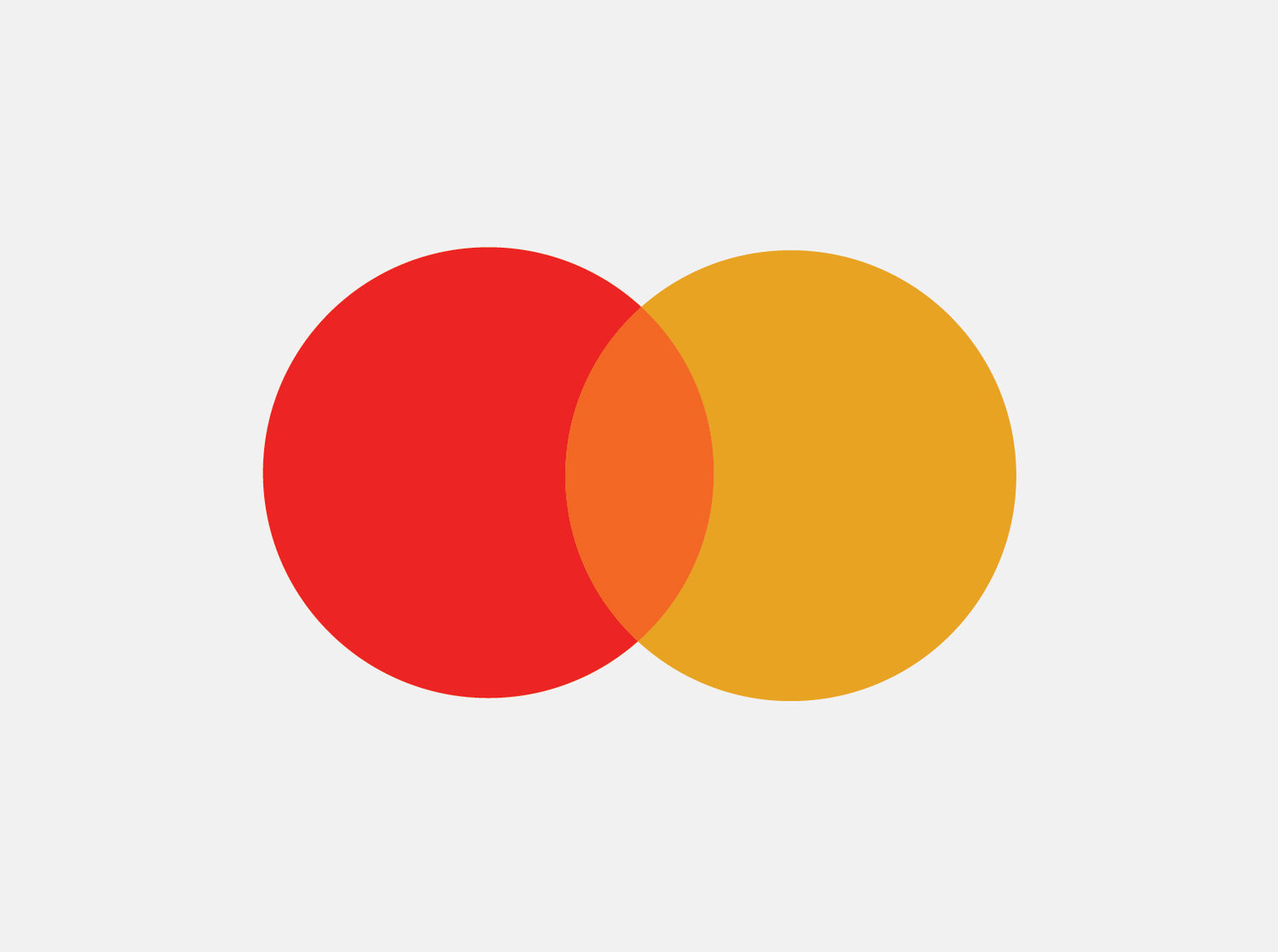
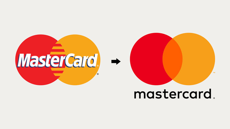
5. MasterCard
MasterCard’s logo went through a complete minimalist transformation while still remaining familiar to its users. What remains the same in both renditions is a red circle overlapping a yellow-orange colored circle, but that’s pretty much the only similarity. The overlap of the circles in the old logo is jagged while the new version is transparent with the middle section colored in orange. The word “Mastercard” has moved from the middle of the circles to underneath them and the font has drastically changed as well, in a style that’s similar to the examples above.
Adweek quoted MasterCard CEO, Raja Rajamannar, on the new design. He stated, “The MasterCard logo is recognized universally…There are 2.2 billion cards that carry the MasterCard logo. There are tens of millions of merchants worldwide that carry the MasterCard logo at the point of sale. The key for us is the equity in that logo–we have to leverage that going into the future.”
What can you learn from MasterCard? Take a minimalist approach to your logo. Weigh out the pros and cons of taking away any extra text or wacky geometrics.
One thing is clear throughout all of these examples: shadows and highlights are out, sleek and skinny fonts that stand alone are in, and a sense of familiarity needs to remain constant when updating a brand’s look.