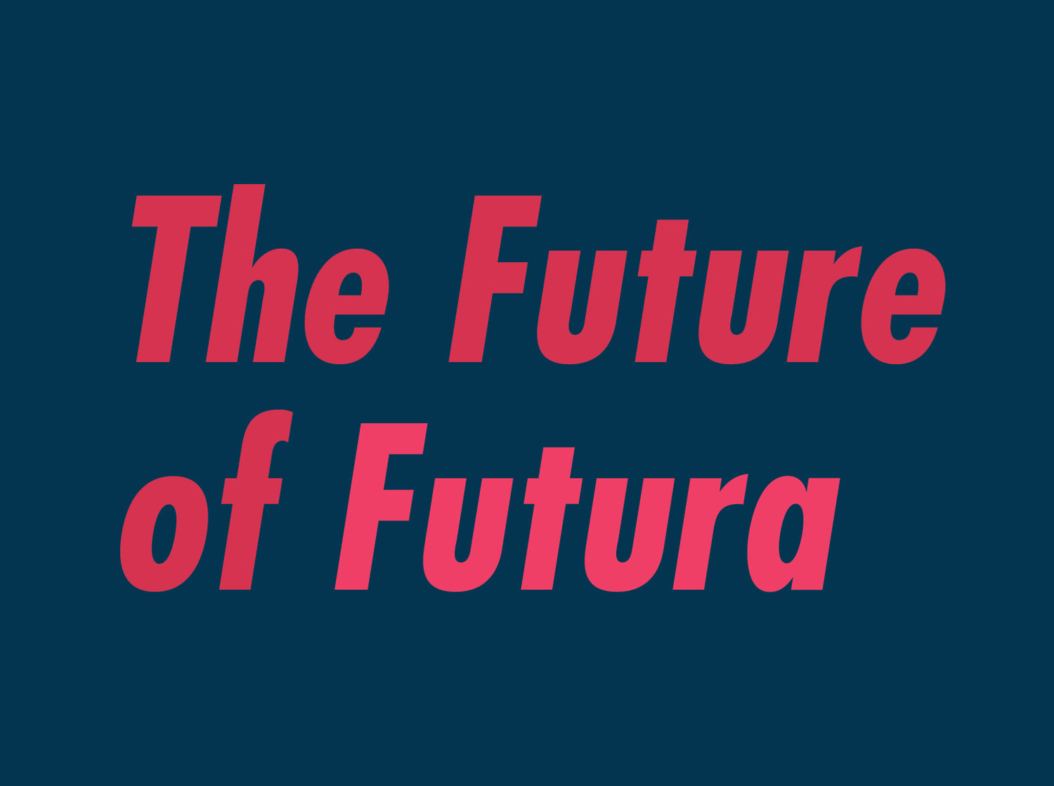
The Future of Futura
More than ever before, designers and, to a certain extent, non-designers have varying opinions about particular fonts and font-uses. What stories can and do fonts tell? What feelings do they evoke and which are the most web-friendly? How expressive is Roboto from Lobster or even the ever-loved though overused Gotham? Sure, there are the standardized fonts for academic and professional purposes (Times New Roman), fonts to avoid (hello, Comic Sans), and go-to fonts for branding (Helvetica). However, a font that has been under a bit of buzz lately is Futura and designer/writer Douglas Thomas has chronicled its history and significance (as well as his personal opinions) in his new book Never Use Futura.
Futura was crafted in the early 20s and released in 1927 by Paul Renner in Germany. Renner wanted to give standardized fonts of his era a makeover; he desired something unified and sleek. Futura was a trailblazer that inspired other fonts such as Twentieth Century, Avenir, and Montreal and it is distinguished by its indirect likeness to human penmanship and the design of each letter displayed in its simplest form. Nike’s “Just Do It” slogan in Futura Condensed Extra Black and Wes Anderson’s use of type in his films and on his film posters (i.e. Grand Budapest Hotel and The Royal Tenenbaums) have made this font more visible to the public eye in the 21st century. Its name was inspired by the goals of the New Frankfurt project, which aimed to provide inexpensive lodgings for Frankfurters, representing both the present and the future.

Source

Source

Source
Never Use Futura was published last month by Princeton Architectural Press and the book seems to echo the popular typography documentary, Helvetica, which was released in 2007. Directed by Gary Hustwit, this film explores the birth of Helvetica (which means “Swiss” in Latin) in early-Modernism. Helvetica’s creation was a direct consequence of overly-colorful and busy advertisements in the 1950s. The documentary provides a narrative for this font alongside attitudes towards what this font can accomplish through interviews of expert typographers. Some claim this font is innovative, not flashy, modern and straightforward, which revolutionized branding. Others assert it is as flat, boring, and lacks that “pop” factors that make successful advertisements.
Douglas Thomas crafted the title Never Use Futura ironically because, according to him, there is purpose for Futura, despite the title suggesting otherwise. He does not fully denounce the use of this font; rather, he suggests that people today are so unaware as to why they are using particular fonts in the first place. Thomas argues that Futura is so widely used that we are unaware of it, which some designers may claim is a positive aspect of the font. Yet, when the human eye becomes familiar with this font, it suddenly becomes inescapable and thus, Thomas wanted to provoke a conversation for both designers and non-designers alike. His book provides a graspable history of Futura’s ubiquity and its functions in the world of typography today.
One Amazon reviewer had this to say about the book, “A book that will redefine the future and history of 20th and 21st-century typography. Illuminative for everyone and a must-read for graphic designers, historians and startups that have any kind of visual component, Never Use Futura manages to be simultaneously groundbreaking and eminently readable. Thomas is obviously a gifted designer himself. The book is beautiful and much like typeface—clean, modern and accessible all at once. I can’t recommend this book highly enough.”

Source
You can read more about the book here or purchase it for $24.95 at your local bookstore or online.
What are your opinions of Futura as a font? Comment below.