The Psychology of Color in Branding and Marketing
Color and Branding
Have you ever selected to purchase from a specific brand solely because of its aesthetic? Up to 90% of snap judgments made about products can be based on color alone. Utilizing these different aspects of color psychology can enhance the outcome of projects, help target audiences perform desired actions, create a personality, and alter how consumers perceive a company:
Perceived Appropriateness or how fitting the color is in relation to what is being sold or offered.
Brand Personality or the lifestyle and emotion you want the brand to give off. What kind of people do you want to draw to your product or service?
Consumer Demographics or the specific demographics of your target audience, and what kind of colors would elicit a draw to your brand.
Competitors Colors or how your competition perceives themselves. Studies show that our brains prefer recognizable brands. This means companies need to be aware of what colors their competitors use and then differentiate themselves.
While all these factors matter, how you build out your brand – the feeling, mood, and image – are what holds the biggest weight in how consumers view the company. All of these factors can be enhanced by color and branding in general.
Color and Marketing Collateral
In terms of graphic design and creating marketing collateral, it is crucial to stay true to your brand and build out a design that appropriately reflects its personality. Although creating marketing collateral is sometimes less experimental than other areas of design, paying attention to color choices and using images and graphics that match the personality of a company are important decisions to make and require a careful understanding of design principles.
Whether you are getting a logo, presentation, one-pager, or any other marketing collateral designed, the correct color choice can give you a huge boost in marketing and conversion. Take into account the often used example of a how changing the color or button boosted conversions by 21%. The button was on a site that had mainly green colors, and by changing the button to red (a blatantly different color) conversions improved drastically.
The Isolation Effect is the idea that something that if “stands out like a sore thumb” it is more likely to be remembered. This is useful when trying to get people to draw their idea to something, such as a sign-up button that blatantly stands out.
The Aesthetic Response to Color Combinations is a study that finds people favor palettes with a highly contrasting accent color. This would mean creating a visual structure consisting of a base of analogous colors (three colors that are next to each other on the color wheel) and then contrasting them with accent complimentary or tertiary colors. Kissmetrics highlights the different kinds of color coordination in this graphic here.
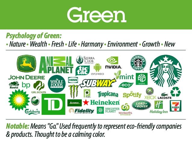
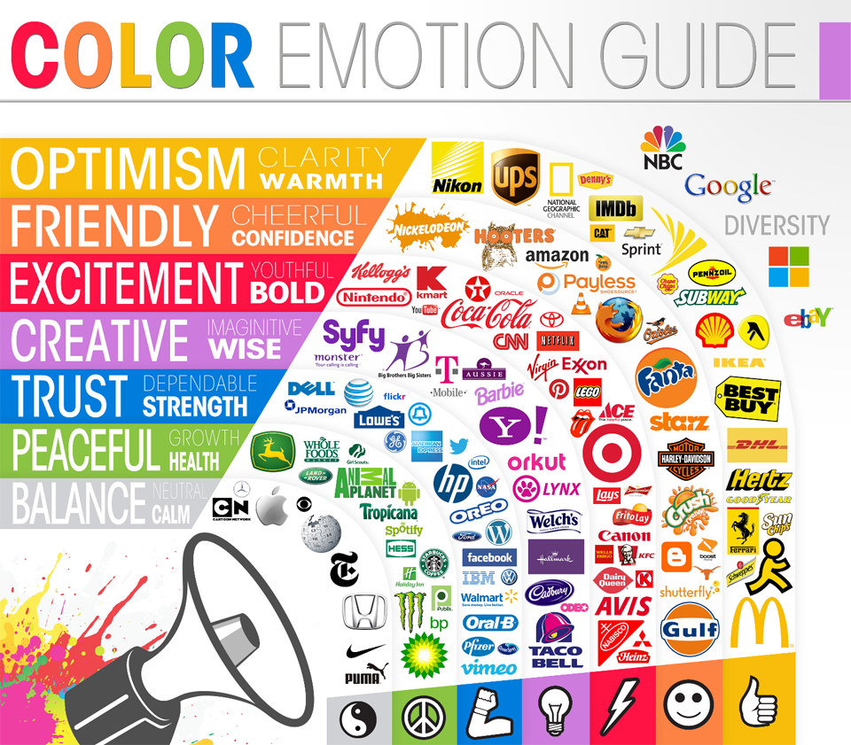
This infographic from Logo Company, a design firm for logos, lays out the emotions each color can evoke and pairs them with example companies. The interactive effects of color, and understanding their effects on emotion, can help us to create more persuading and influential design.
Read more on the power of visuals in our post here, or on color psychology in Psychology Today’s article, Color Psychology: How Colors Influence the Mind.
ConceptDrop is a marketplace that uses AI and data to automatically match creative projects with the best-fit freelancers. Learn more or get in contact here.