Simplicity Is The Ultimate Sophistication: A Look At The Evolution of Logo Design
“Simplicity is the ultimate sophistication.”
– Steve Jobs
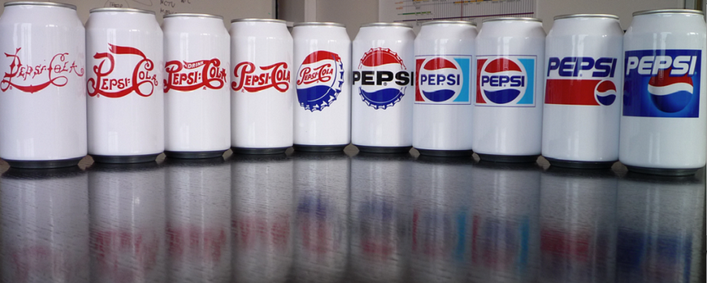
Logos have to properly embody a company’s overall mantra, but in an aesthetically pleasing design. It must represent both nostalgia and modernity; both complexity but also simplicity. Each company’s logo evolves over time, altering its look to please consumers and reflect changes in major design trends. I have chosen five notable companies that perfectly display the movement towards design simplicity. While many argue that Apple began this major movement through Steve Job’s love of simple design, many companies have adapted a simpler look to reflect ease of use and sleekness. Take a look at some example companies below:
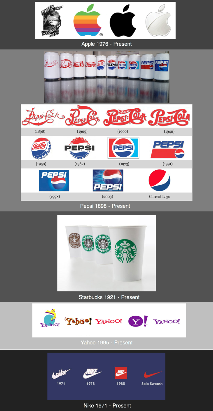
The shift towards simplistic design makes each logo appear more clean, user friendly, and sophisticated. Not only has this movement influenced logos to change, but it has influenced websites, user interfaces, and advertising. While some consumers may yearn for the historical logos and dislike this movement, there is no denying that adapting to this change is necessary in order to remain innovative and relevant.
Image Sources:
Source 1, Source 2, Source 3, Source 4, Source 5